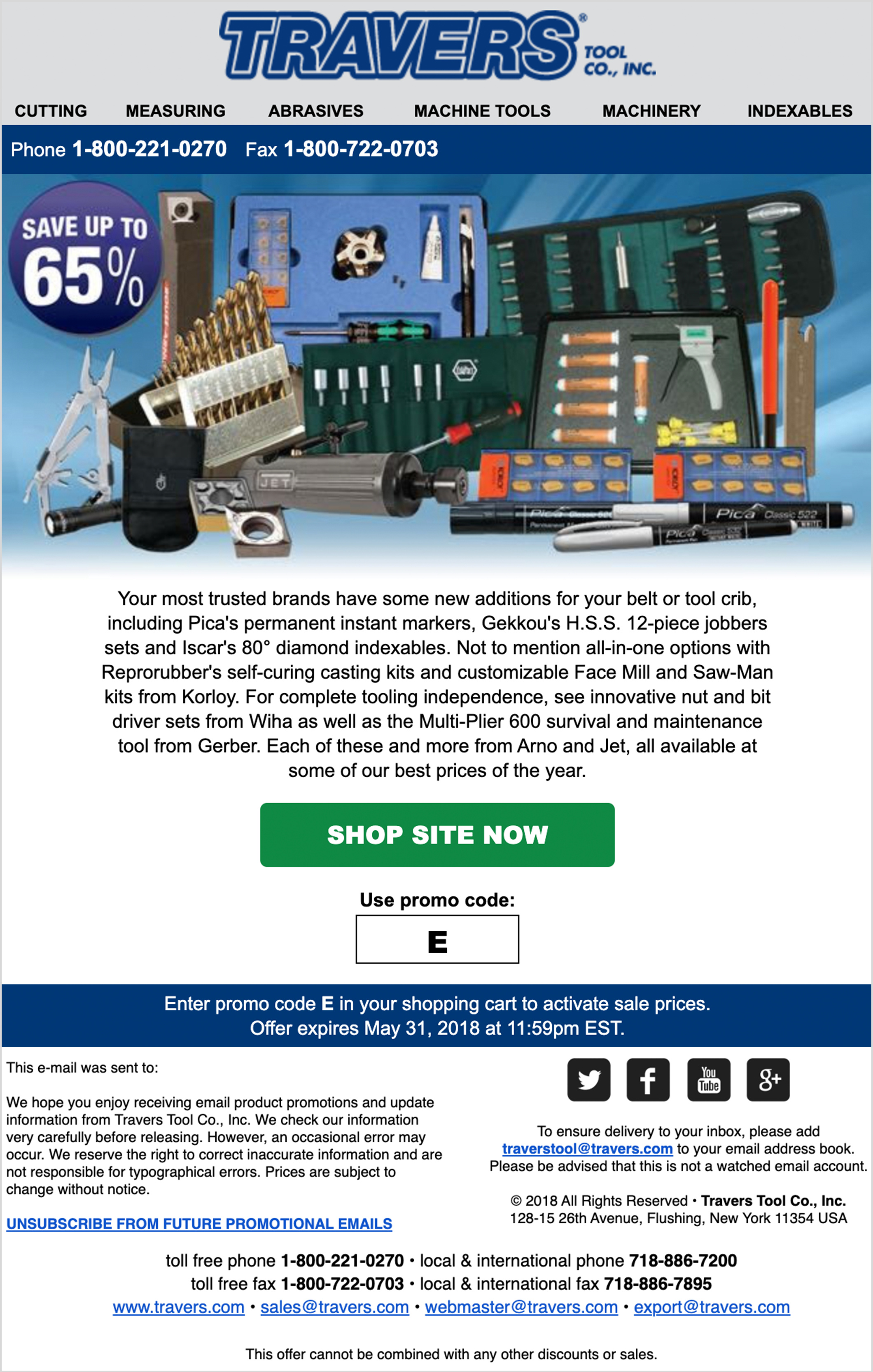
Email Redesign for Travers Tool Co.
The purpose of this project was to concept and design new email templates with Travers Tool Co.’s updated brand guidelines. The challenge was to create emails that remain simple and straightforward while still retaining rich, technical information common to the B2B metalworking industry.
Project Goals
My primary goals were to:
Implement a clear sense of hierarchy. By adding ample white space and proper alignment, customers can easily focus on the product(s) or discount being offered. The wireframes are built with Travers Tool Co.’s official colors to further visualize how their branding will be utilized across this medium.
Strengthen Travers Tool Co.’s brand presence. The original email design lacked the consistent branding that Travers Tool Co.’s printed material has. Many of their customers often rely on both web and print collateral before making purchases, so ensuring a consistent look-and-feel was vital. Introducing bolder typography and a well-defined blue-and-gray color palette now reinforces their brand guidelines, allowing for a more seamless transition between web and print (and vice versa).
Email WIREFRAMES:
BEFORE & AFTER
In addition to layout and branding updates, I collaborated with the Brand Manager to introduce more nuanced improvements:
Stronger imagery. We started incorporating action shots of advertised tools instead of static product collages.
Stronger body copy. We moved away from blatantly listing specific products in favor of a more solutions-oriented message (and slight humor).
More aptly-named coupon/promo codes. This made the email more memorable for customers, instead of providing them with an arbitrary letter.


